






Carlos Kun retweeted

When I interviewed at @resend, the online handbook caught my attention. It helped me understand how the team thinks and works, and it was one of the reasons I wanted to join the company.
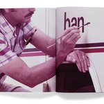
A few months later, I had the chance to turn it into a book with the design team.


Carlos Kun retweeted

I have a design crush on @domesticetch. One of the things she hits on in this conversation from our chat on @Shopify's internal design podcast is the importance of having the language to describe why something is working. This is one of the highest-leverage skills for designers today whether collaborating w/ humans, robots, or both. Consume visual material broadly and practice articulating why you love what moves you.
(A brilliant designer, teacher, writer, and historian, Elizabeth is a great follow on all channels - including @itsnicethat, where she's the US editor-at-large.)


Carlos Kun retweeted

The layout discipline and spatial pacing in this web experience for UDS Studio is so good. The design removes all unnecessary noise, relying on simple but beautiful typography, generous negative space (the most difficult point to explain to most non-designers), and disciplined multi-column grids to let the work take center stage.
abduzeedo.com/uds-studio-cra…


Carlos Kun retweeted
The best thing about using AI to build my ideas is that it frees me up to experiment with the fun details I used to skip for lack of time and knowledge, like having fun with loading animations with text effects. Check it out on abduzeedo.com :)
Carlos Kun retweeted

Piet Zwart, Brochure for Nijgh and van Ditmar, 1931
Archived by @marinabyocean
From Letterform Archive
#PeoplesGDArchive
#GDArchive


Carlos Kun retweeted

Back at it: added a search bar and category filter to @africandsgn landing page. Definitely digging the micro-interactions.

Spent the entire day building @africandsgn; a living digital archive for African graphic design, with my buddies @nextjs, @reactjs, @sanity_io, and @claudeai. Still a WIP, but it's feeling right.
Carlos Kun retweeted
Editorial Design: OFF SPACE Visual Exploration
Milanese studio Gabriele Colia conceptualized editorial design systems representing abstract multidimensional activation...
abduzeedo.com/editorial-desi…


Carlos Kun retweeted

⚫️ After a hiatus Icographica is back.
Follow for design inspiration. Use #icographica to be featured.
Link below:


Carlos Kun retweeted

From Metro Signs to TV Icons: The Architect Who Built São Paulo’s Identity.
João Carlos Cauduro, alongside his partner Ludovico Martino, revolutionised Brazilian visual identity in 1969 with the creation of the TV2 Cultura logo. Moving away from the era’s ornate and literal broadcast symbols, Cauduro applied a strict "Total Design" philosophy rooted in geometric precision and functionalism. The result was the iconic "bonequinho" (little doll), a minimalist silhouette of a human figure constructed from simple shapes. This figure was designed to humanise the medium, reflecting the station’s educational mission to put the viewer and culture at the centre of its programming.
The logo’s enduring power lies in its modularity and clarity. Because it was built on a rigorous grid, it remained legible across various media, from static print to early television animations. Beyond its technical excellence, Cauduro’s design became a symbol of modern São Paulo, helping to define the city’s aesthetic landscape. Decades later, the logo remains almost entirely unchanged, serving as a testament to Cauduro's vision of timeless, sustainable design.
#logodecks
