

Product design • Mobile app design • Web app design • Website and Landing page design • Pitch decks
Remote
Joined August 2019
- Tweets30.3K
- Following262
- Followers480
- Likes7.6K




Pinned Tweet
This is why I design on @figma
You can see in real time how the idea for a single experience went through multiple stages of iteration with each iteration serving as the foundation for the next
Every time i iterated, i saw the progress but at the same time, something felt missing so i kept working
Have i made progress with this experience from the first draft? Yes
Am i satisfied with where it is right now? Yes
Am i done tinkering with ways to improve it? NO
And that's why Figma is so important. It sets your imagination on fire, let's you tinker, let's you do your best work
Figma lets you think of reasons why Iteration A will work and why it will not work so it's time for Iteration B


Over the past few days, i have been working on these App store screenshots for surge.
Saying I love the results would be an understatement
Surge is an app that helps users track and monitor their activities with a twist.
Surge brings in community to help users stay accountable whenever their motivations starts fading. Surge has community events for users to all participate in, build real friendships that help everybody stay the course


Oluwatobi • Design retweeted
On today’s episode of doing the kind of work I wanna get hired for:
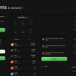
I explored how @trylimitless could bring trade discussions closer to the markets they’re about. The concept brings together existing social features and gives traders a place to share a position, compare perspectives, compete and discover markets together.
I also reworked the football match view to make key events, especially goals and scorers, easier to scan.
The question I’d love to explore next: can in-app discussions lead to more meaningful market discovery and participation either casually or for competition?
@denislab @larionov_al


Oluwatobi • Design retweeted
A badge in 2 states
The colorful variant is the default and it’s used when the user is active
The greyed out variant is the frozen state and it’s used when the user is inactive. This frozen states serves as a silent nudge to get users active once again


A badge in 2 states
The colorful variant is the default and it’s used when the user is active
The greyed out variant is the frozen state and it’s used when the user is inactive. This frozen states serves as a silent nudge to get users active once again


Oluwatobi • Design retweeted
Track your basketball sessions on Surge
Good morning, lets get it this week


On today’s episode of doing the kind of work I wanna get hired for:
I explored how @trylimitless could bring trade discussions closer to the markets they’re about. The concept brings together existing social features and gives traders a place to share a position, compare perspectives, compete and discover markets together.
I also reworked the football match view to make key events, especially goals and scorers, easier to scan.
The question I’d love to explore next: can in-app discussions lead to more meaningful market discovery and participation either casually or for competition?
@denislab @larionov_al


Oluwatobi • Design retweeted
These are group chats on Surge
Surge has several communities and each community has their own identity. You can see the identities of each community in their chat bubbles and inline event banners across several states.
More on the event banner; If a user decides not to take part in an event, the banner loses its color and becomes neutral to signify to the user not just in words but with color.
No decision is permanent either, the user can change their mind and still return to the the default state of the banner by interacting with the button


