Specialists in web design & system integration, branding & design. Say goodbye to endless spreadsheets & isolated systems & hello to REAL TIME CONNECTIVITY.
Cambridge, UK
Joined March 2009
- Tweets952
- Following235
- Followers173
- Likes87
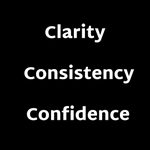





What every brand needs before design starts:
1️⃣ Clarity of purpose
2️⃣ Consistent story
3️⃣ Confident voice
That’s how Airbnb, Glossier, and Monzo built loyalty before launching their logos.
Need help defining yours?

Accessible design isn’t optional anymore—it’s essential. From colour contrast to screen-reader support, inclusion is the foundation of today’s digital experiences.

Your typeface speaks volumes. Sans-serif suggests modern clarity, while serif indicates tradition and strength. Weights, spacing, and hierarchy influence the flow. Typography embodies your brand voice. In a fast-paced world, are your fonts delivering the right message?

Colours aren’t decoration—they’re signals.
🔵 Blue builds trust (hello, B2B).
🟢 Green encourages action.
🟡 Yellow sparks creativity.
❤️ Red creates urgency.
The hues you choose shape how your brand is felt before a word is read.
Are your colours aligned with your audience?

Netflix isn’t just about movies; it emphasizes seamless user experience.
👉 Simple personalization
👉 Easy navigation
👉 Informative micro-copy
Your site doesn't need to be Netflix, but aim for intuitive journeys, clear messaging, and a user-centered approach.

Have you seen a brand with consistent web, social media & print presence? That’s deliberate uniformity. Every font, colour & image conveys the same message. Consistency boosts recognition, builds trust, and increases conversions. Is your brand recognisable across all platforms?

How resilient is your website?
Let’s find out → [insert link or call to action]
#UX #WebDesign #CustomerFirst #DigitalStrategy #InteractionDesign
In a shifting digital landscape, only the adaptable succeed.
We design websites that are:
⚡️ Fast
🛡 Secure
🔮 Future-ready
✅ Website Resilience Checklist (Summer Edition):
• Loads in under 2 seconds?
• Optimised for mobile-first users?
• Plugins, integrations & CMS up to date?
• Can handle traffic spikes?
• Protected from downtime & threats?
• User journeys converting?
🔥 Heatwaves force us to adapt — your website should too.
Just like rising temps test our limits, changing digital conditions test your site. Is it built to thrive or crack under pressure?
Let’s find out. 🧵
#UX #WebDesign #CustomerFirst #InteractionDesign

During COVID, empathy led the way.
Dove’s campaign showed real NHS heroes—mask marks and all.
💙 Real beauty = resilience.
Design went clean & calming.
Marketing went digital, human, and heart-first.
#UX #EmpathyInMarketing #UserExperience #DesignTrends