

Running https://xitter.gq/t.co/k1b7LOeliO / Making complex AI & tech products easier to understand, trust and buy through brand & web design. Clients raised $15M+.
Send DM or explore yourself →
Joined October 2024
- Tweets7.8K
- Following469
- Followers2.3K
- Likes9.4K





Over the last 2 years, I’ve worked with AI companies valued at $500M+ and backed by $15M+ in funding. And one of the biggest problems I’ve seen has nothing to do with their technology.
It’s how they communicate it.
Founders and engineers love talking about their models, infrastructure, latency and everything they’ve spent years building. But most people visiting their website are trying to answer much simpler questions.
What does this product do? Is it for me? How is it going to make my life easier?
When I’m designing websites for these companies, my first priority is making those answers immediately obvious.
That starts with understanding who the product is for, what problems it solves and why someone would choose it. Then translating that into clear messaging, a logical page structure and product visuals that actually demonstrate its value.
I want someone who’s never heard of the company to understand what the product does and why it matters within a couple of minutes.
Because when a website makes people work to understand the product, it creates real business problems. Potential customers leave without understanding the value, sales teams spend more time explaining the basics, and money spent attracting visitors produces fewer opportunities.
You can build the most sophisticated technology in the world, but if people can’t understand why they need it, that sophistication won’t help you sell it.
The technology can be complex. The experience of understanding it shouldn’t be.
2
2
212


Projects section for an aerospace comapny website 📌
The white page folds like a tri-fold and the cork board shows up behind it. Every project is pinned on a different paper: graph, blueprint, legal pad….

9
359
A lot of founders come into a branding project with references already in mind.
Brands they love, identities they admire, things they’ve seen that they’d like to bring into their own company.
And I completely get it. When you see something beautifully designed that communicates exactly what you think a brand should, it’s natural to want something similar.
But I think that’s where things can get tricky.
What works for one brand might have very little to do with another. Different product, different audience, different personality, different reasons for existing.
And if you start building around those references too early, they can end up shaping the identity before you’ve really understood the company behind it.
I think references are great for exploring how to express an idea. Just not for deciding what that idea should be in the first place.
3
2
301
Most projects at Atreo start with a lot of questions, rough ideas and messy notes.
Before touching the design, we try to understand the product, who it's built for, what makes it different and why someone should care about it.
Once we have that figured out, we work on the messaging and information structure. What should visitors understand first? What needs more explanation? What can we remove? We want every section to have a clear purpose before we start thinking about how it should look.
Then comes the visual direction. Typography, layouts, interactions, illustrations and all the details that bring the experience together. That's where we explore different approaches, test ideas and refine until the design communicates what we want it to.


7
580
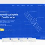
New WIP for an aerospace project 🛰️
We went with blueprints, sketches and handwritten details instead of the usual futuristic visuals and 3D renders.
I’ve always believed good design comes from understanding an industry, not blindly following its visual conventions.

2
24
615
I genuinely think we're reaching a point where the biggest limitation in web design isn't what you can build anymore. It's what you're capable of imagining.
A couple of years ago, I'd come up with an idea and immediately start thinking about how difficult it would be to execute. Now I can spend much more time exploring how far I can actually take it.
The tools we have today make experimenting with ambitious ideas so much more accessible. But they don't give you the ideas, the taste to make the right decisions, or the judgment to know when something actually works.
And I think that's what makes this such an exciting time to be a designer.
Because when building something becomes easier, what really sets your work apart is what you choose to create in the first place.


4
18
451
A closer look at this one, an agritech website I'm working on at Atreo. I like how the product data sits directly over the fields here, giving each number a place and a bit more context.

3
8
364
Been playing around with motion a lot more lately at Atreo.
Here's a little experiment for Strata, taking three product visuals and bringing them together into one continuous animation.
3
12
498
Over the last 2 years, I've worked with tech companies that have raised $15M+ in funding. And one thing I've learned is how easily small UX mistakes can undermine an otherwise great product.
Error messages are a perfect example.
Imagine spending 10 minutes setting up a workflow, uploading files, or configuring an integration, only to get a message saying "Something went wrong."
Now you don't know what failed, whether your progress was saved, or what you're supposed to do next. What should've been a minor issue becomes a frustrating experience, and potentially a lost user.
That's why, when designing error states, I focus on three things: explaining what happened, making it clear whether the user's work is safe, and giving them an obvious way to recover.
A technical error doesn't have to become a bad user experience. But when you leave people guessing, you're making it much easier for them to give up.
And for a startup investing time and money into acquiring users, losing them over something this preventable is a pretty expensive mistake.
2
3
191
A few new screens for Dreumy. Really enjoying how this product is shaping up, especially the balance between a calm interface and all the functionality behind it.

1
7
175
One of the trickier parts of designing Modo has been figuring out how to show what four AI agents are doing without making the whole thing feel complicated.
This is an exploration of the workflow view, where you can see what's finished, what's moving, and where the team needs to step in.
Pretty happy with how this one turned out.

5
11
260


Spent a good part of today designing the onboarding for Modo, a multi-agent AI workspace we're building out as a full brand, web and product project at Atreo.
Really enjoying how this one is coming together. Still plenty left to design.


2
9
411

I recently had a call with a tech founder spending $10K/month on ads to acquire users for their product, only to lose too many of them right after signup.
One of the first things those users saw? An empty dashboard saying "No activity yet."
They'd paid to bring someone into the product, only to show them a screen with no clear next step, no visible value, and no reason to keep exploring.
That's how poor product design can turn acquisition spend into inactive accounts.
When I design empty states, I treat them as part of the activation experience. Show users exactly what to do first, let them preview what the product can do, or give them a simple way to experience its value without setting everything up themselves.
The goal isn't to make an empty screen look better. It's to help users understand the product and take the next step toward actually using it.
Because spending more money to acquire users won't solve much if your product keeps losing them before they experience its value.
3
5
270