

Creative ideas. Made real. Design • Websites • Automation • UGC Ads • Video I help brands stand out & grow without technical headaches.
United Kingdom
Joined August 2024
- Tweets5.3K
- Following3.3K
- Followers2.8K
- Likes10.6K









Pinned Tweet
The best souvenir can be the ordinary thing that accidentally travelled through the whole story.
A bakery wrapper, a train ticket or a small notebook can hold the memory more clearly than something with the city name printed across it. The connection comes from what happened around the object. It is a useful reminder that meaning often arrives through use, rather than being fully installed by the packaging.
A surprising number of useful conversations begin with someone asking what a small button does.
There is no grand introduction, just a little uncertainty about an object in front of both people. The explanation gives them something to share. Ordinary curiosity can be a good social doorway because nobody has to invent an impressive topic before the conversation is allowed to begin.
A very ordinary question can be an excellent way into a conversation.
Small things. together..
A speculative concept campaign for a travel pouch, built around a familiar object with a distinct visual personality. The concept celebrates a small object's ability to give a collection a home. An orderly arrangement of familiar things makes the idea legible without filling the artwork with capacity claims.
The composition gives the product the leading role. Scale, lighting and a controlled colour palette carry the story, while supporting props establish an everyday context. The intention is to make the scene worth looking at and the object easy to understand.
This is independent concept artwork for a fictional unbranded product, rather than a commissioned advertisement.
Need a product campaign? DM @mrcreatech.

An afternoon can feel surprisingly different when you wear something you genuinely like.
It does not have to be new, expensive or suited to an occasion anyone else considers important. Sometimes a familiar shirt or a colour you enjoy changes how you inhabit an ordinary day. Getting dressed can be a small personal choice rather than a public statement, even when the only audience is the shopkeeper and the person delivering a parcel.
What's your ordinary-day outfit that always feels right?
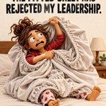
Some household objects seem to come with their own opinion about how they should be handled. You start with four corners and confidence, then somehow end up holding a large elastic argument. The cupboard will eventually receive something roughly rectangular, which feels like a reasonable agreement.
Every attempt creates a new shape that could generously be described as folded. You try matching corners, then reconsider what a corner actually means in this context. Eventually the sheet enters the cupboard as a confident bundle, and everybody agrees that the important thing is that the door still closes.
Have a relatable campaign idea? DM @mrcreatech.

Objects can become more interesting through care rather than through being replaced.
A worn handle, a repaired seam or a polished surface can make something more appealing because its history is visible. Product storytelling does not always need pristine perfection. Sometimes a believable sign of use helps a viewer imagine a longer relationship with the object than a spotless studio image can suggest on its own.
Every family has a recipe that is apparently being made incorrectly by everyone else.
Everybody remembers the original differently. One person adds something that another insists was never there. The argument is affectionate because the food holds shared history and individual memory at once. A recipe can travel through a family like a story: recognisable in every telling, changed a little by the person who carries it forward.
Which family recipe has the most fiercely defended version?
Your map needs a landmark.
Directions like next to the bakery can be easier to follow than a bare pin when the entrance is hidden. Pair the location with a recognisable landmark and a photo of the doorway.
The final few metres of a journey deserve as much attention as the address.
The illustration makes the comparison concrete so the idea can be understood without specialist vocabulary. Look at the object in the setting where someone encounters it, then decide which piece of information they need at that moment. That small shift in perspective gives the design a useful job.
Explore my services: mrcreatech.site

One concrete explanation can make a whole exhibition easier to enter.
A simple explanation changes how you look at the material, the shape or the slightly unusual detail. You begin noticing decisions instead of just judging whether you like the result. Creative work becomes more approachable when the explanation offers a way in rather than a vocabulary test at the entrance.
The knowledge is most useful when somebody else can find it too. A clearly named folder or a recognisable physical place gives that private expertise a way to survive the moment its usual owner is out.
A film trailer can make a whole cinema briefly share the same little conversation.
A familiar face appears, somebody recognises the music and a few scattered reactions become part of the room. The main feature has not started, yet the audience already exists as a group. Watching something publicly has that extra layer: you experience the story and the changing attention of the people who happened to choose the same evening.
Do you enjoy the trailers, or arrive just before the film?
A jar with an excellent lid starts negotiating its second career immediately.
You can already imagine a useful future for it, even if the house contains several jars waiting for similar opportunities. The object has demonstrated one excellent quality and now you feel obliged to reward it with a purpose. Household collecting is not always about sentiment; sometimes it is simply admiration for a very satisfying container.
Let people compare.
A comparison becomes confusing when every option uses a different reference point. Put the same information in the same position and make differences visible.
Consistency gives the reader a stable base for choosing between genuinely different options.
The illustration makes the comparison concrete so the idea can be understood without specialist vocabulary. Look at the object in the setting where someone encounters it, then decide which piece of information they need at that moment. That small shift in perspective gives the design a useful job.
Have a project in mind? DM @mrcreatech.

Let dinner begin.
A speculative concept campaign for a cast-iron skillet, built around a familiar object with a distinct visual personality. The skillet becomes the visual centre of a meal before cooking begins. Charcoal metal against orange gives the scene energy while the raw ingredients suggest possibility rather than a specific performance claim.
The composition gives the product the leading role. Scale, lighting and a controlled colour palette carry the story, while supporting props establish an everyday context. The intention is to make the scene worth looking at and the object easy to understand.
This is independent concept artwork for a fictional unbranded product, rather than a commissioned advertisement.
Explore my services: mrcreatech.site


The parcel check.
The first few minutes after delivery are a good moment to compare the parcel with the order record. Check the item, variant and included pieces while the packaging and reference are still together. It is easier than reconstructing the details later.
The sequence starts with a familiar situation, makes the missing context visible and offers one manageable change. It is deliberately practical: something a person can understand and try without learning a new system or buying another tool.
Keep the reference until you know the order is complete. A useful piece of communication should make the next encounter easier for the person who will actually use it. That includes ordinary moments at home, in a shop and on a phone.
Need clear visual communication? DM @mrcreatech.


Room for a thought.
A speculative concept campaign for a hardcover journal, built around a familiar object with a distinct visual personality. The campaign imagines a notebook as a physical place for an unfinished thought. Fabric, paper and a restrained writing prop provide the texture while the headline gives the scene its emotional angle.
The composition gives the product the leading role. Scale, lighting and a controlled colour palette carry the story, while supporting props establish an everyday context. The intention is to make the scene worth looking at and the object easy to understand.
This is independent concept artwork for a fictional unbranded product, rather than a commissioned advertisement.
Need a product campaign? DM @mrcreatech.

“What did you think I meant?” can save a surprising amount of conversation.
You finally hear the version the other person has been answering. Sometimes the disagreement becomes much smaller once both people are discussing the same sentence. Have you ever solved a misunderstanding that way?
The phrase 'easy to clean' gets much more interesting after you have cleaned something awkward.
Corners, seams and removable pieces suddenly become important parts of the object. Experience changes the details you notice. A useful demonstration can show the cleaning process plainly, leaving the viewer to judge the practical work involved instead of asking a polished adjective to carry the whole argument.
Which object taught you to question “easy to clean”?
Renewal should be visible.
A recurring service should make the renewal date and billing period easy to locate. The important information belongs near the action, not behind a maze of account screens.
Clear expectations help customers decide calmly instead of discovering the arrangement later.
The illustration makes the comparison concrete so the idea can be understood without specialist vocabulary. Look at the object in the setting where someone encounters it, then decide which piece of information they need at that moment. That small shift in perspective gives the design a useful job.
Explore my services: mrcreatech.site

A name inside a second-hand book is a small clue to a life you'll never fully know.
Someone chose it, carried it and decided it belonged to them. Now it has arrived in another pair of hands. That small trace can make the object feel more interesting without revealing anything dramatic. You are sharing the same pages with an unknown reader across time, joined by an ordinary decision to open a particular book.
What would you want to find inside a second-hand book?
After enough cinematic product shots, one honest full view feels unusually helpful.
You finally see the whole object, its proportions and the pieces that belong with it. There is room for both kinds of image. Atmosphere can make someone interested, while an uncomplicated view helps them understand what they are considering. The strongest presentation knows when each of those jobs needs its own space.
The safe place made perfect sense when you chose it. It was quieter, tidier and obviously better than leaving the thing in its usual spot. Now the search includes several cupboards and a sincere attempt to recreate the exact personality you had when you moved it.
You have already checked the usual place, despite moving the item specifically to improve on that arrangement. Now you are inspecting places that make progressively less sense. There is a certain point in the search when finding it somewhere obvious would be both excellent news and a small personal insult.
Have a relatable campaign idea? DM @mrcreatech.
