

The in-house CRO team you don't have to hire. Offers, pricing, funnels, LPs for 8-figure Shopify brands. A full senior pod for less than one in-house hire
8-figure Shopify brands only
Joined January 2021
- Tweets2K
- Following478
- Followers1.8K
- Likes5.6K





Pavlo Levchuk retweeted
Everyone thinks CRO means ADDING features to increase conversions.
We did the opposite and made MORE money.
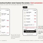
Client's cart drawer had upsells and pre-checkout popup added over time.
We removed them and simplified the flow.
Results:
→ CVR: +30.71%
→ RPV: +25.97%
→ PPV: +25.75%
→ AOV: -3.63%
More conversions but slightly lower AOV.
The main result: 25%+ more profit per visitor.
Removing friction increased conversions more than upsells increased AOV.
Sometimes the best optimization is removing things, not adding them.

Pavlo Levchuk retweeted
Most brands optimize mobile for device
We optimized for WHO uses the device
Client had standard mobile optimization:
→ Responsive design
→ Fast loading
→ Touch-friendly buttons
Mobile CVR: 2% (85% of traffic)
Desktop CVR: 3% (11% of traffic)
The insight: Client targeted people aged 60+.
Older customers have worse eyesight - they zoom differently on phones.
Standard "mobile responsive" didn't account for this.
Solution:
Increase font size by 2px on mobile.
Result:
Mobile CVR increased from 2% to 2.1% (+5%).
Mobile optimization isn't just technical responsiveness - It's understanding who your actual customers are.
Different age groups use phones differently.
Optimize for your audience, not just the device.
Pavlo Levchuk retweeted
Announcement bar CTA test:
Week 1-3: Looked like loser
Week 4: Won
Collection page filter test:
Week 1-2: Looked like confident winner
Week 3-4: Became neutral
Pattern:
→ Early data misleads
→ Volume reveals truth
Our rule: 1,000+ conversions per variant minimum.
The difference:
→ 95% confidence tells you statistical certainty
→ 1,000+ conversions tells you if you have enough data to trust it
Small samples create false signals.
Large samples reveal real patterns.
Wait for real data and don't let it lie to you.
Pavlo Levchuk retweeted
Low-hanging fruit for stores with many SKUs:
On collection pages, add badges like “Best Seller,” “New In,” or “Low Stock.”
We’ve run this test many times for our clients.
100% win rate.
Why does it work?
When you have lots of SKUs, visitors face too many choices.
More choices = more friction.
Badges guide them toward what’s most relevant, making the decision easier.
Result: less friction, more sales.
Pavlo Levchuk retweeted
We removed all upsells from the cart.
The results were wild:
+20.25% CVR
+4.53% RPV
-12.35% AOV
Yes, AOV went down (duh).
But the CVR uplift made up for it.
Context:
The cart and pre-purchase upsells weren’t very complementary.
They felt too salesy for this brand.
Lesson:
Be careful what upsells you put in the cart.
If the upsells don’t fit perfectly, they can hurt your profit per visitor instead of helping it.


Pavlo Levchuk retweeted
Jewelry brand had free shipping at $75. AOV was already $100.
We tested $100 and $120 thresholds.
$100: minimal impact.
$120 won:
+5.93% conversion rate
+9.46% revenue per visitor
+9.89% profit per visitor
+$37K monthly
Premium customers expect to spend more.
Most brands set thresholds too low.

Pavlo Levchuk retweeted
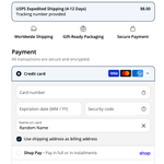
Can’t believe we used to offer free shipping on every order.
Earlier this year, we started charging for shipping.
Conversion rate didn’t drop. Profit grew instantly.
Last week, we tested raising the fee again.
From $3.99 → $5.99.
Revenue per visitor jumped almost 10%.
The crazy part?
Our control group (with the lowest shipping fee) actually performed the worst.
Great work by @pavcro 🔥🔥


Pavlo Levchuk retweeted
I’m working with a high-ticket wellness brand that scaled to 7 figures fast using a simple Ad → Product Page funnel.
Only later did we find a winning advertorial—but it took multiple iterations and a decent investment in testing.
You can likely explain most of the product directly on the product page.
→ Set up post-purchase surveys (“What made you buy?” / “What almost stopped you?”).
→ Check Reddit and reviews (yours + competitors) to see what matters most.
→ Use those insights to improve descriptions, add key sections below the buy box, and expand FAQs.
Pavlo Levchuk retweeted
I get my most impactful A/B test ideas from…
A/B tests.
How?
By combining results from previous tests.
Let me explain.
Imagine you tested this:
1. Moving a bundle product to the top of the collection page
2. Adding a carousel with bundle products to the homepage
Both of them were winners (AOV and CVR increased).
What can you learn from these 2 tests?
→ People are willing to buy bundles if they are aware of them
What next tests can you try?
→ Upselling a bundle on the product page or in the cart
And it works not only in CRO:
- Ads creatives
- Email templates
- Landing pages
You can learn from previous tests everywhere.
So test and learn as much as possible.
---
Hope you find this valuable.
→ CRO is the easiest way to increase revenue without spending more on Ads. Learn more via the link in the comments👇

Pavlo Levchuk retweeted
Bundles is one of the easiest ways to increase AOV.
Why do they work?
1. Higher margins allow for bigger discounts
2. Increased perceived value
3. Complementary products make it a no-brainer for a visitor
The challenge is upselling bundles on single product PDPs in a smart, seamless way.
That’s exactly what we solved for our client:
→ Added a bundle as a variant on PDPs
→ Clearly communicated its value through labels and discount badge
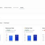
The test led to a +7.93% increase in Revenue per Visitor, adding approx. +$30,569 in monthly revenue.
It's all about showing the value.

Pavlo Levchuk retweeted
Don’t waste your time. If you have enough traffic, test multiple variations in each test.
That’s how we tested the announcement bar messaging + link combo.
Got 5k+ orders in EACH variation.
Don’t tell me anything about stat sig.

Pavlo Levchuk retweeted

The unfortunate truth about CRO is the test ideas shared on X, Linkedin, Slack likely won't move the needle much for your brand.
You have to do the slow tedious work of auditing all available data sources and coming up with a unique testing roadmap tailored to your brand.
Pavlo Levchuk retweeted
Here are the main aspects of powerful website navigation
See below how top DTC brands do that


Pavlo Levchuk retweeted
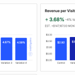
This A/B test got us a 3.34% RPV increase and 2 valuable learnings.
Here's how:
We work with a brand that sells single products and bundles.
Recently, we conducted 2 tests for them:
- Test 1: Loser
- Test 2: Winner (on the image)
Here's what we did:
Test 1: Added single products on the homepage
For some reason, they only had bundles here.
We added a single products slider above bundles to boost CVR.
Result: CVR stays the same, RPV dropped by 4%.
Test 2: Moved bundles to the top of PLP
We knew that bundles could perform better.
So we made them more noticeable for PLP visitors.
Result: 2% CVR and 3.34% RPV increase.
Learnings:
- Visitors often prefer bundles (better deals) over single products
- We should test promoting bundles more on the website and ads
And that's it!
Hope you found this valuable.

Pavlo Levchuk retweeted
We increased Revenue Per Visitor by 20.53% for the ecom brand with this A/B test.
Here’s how:
1. Added expanded search bar under the main navigation
2. Added empty search recommendations

