
Independent type designer based in NYC. Logotype / Typeface / Multilingual typography
New York, NY
Joined July 2017
- Tweets101
- Following378
- Followers959
- Likes693




Typeji retweeted

✨UPDATE✨ Eliptico v0.2 by @typeji adds two new italic styles, in Bold and Black weights. Webfonts have also now been included in this high contraster. What’s next? More styles!
futurefonts.xyz/typeji/elipt…


Typeji retweeted
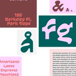
✨NEW RELEASE✨ Waverse v0.1 by @typeji has arrived! Inspired by ocean waves and currents, its rounded corners and subtle slant evoke a gentle, continuous wavy rhythm along the x-height, reminiscent of the waves of the sea. 🌊
futurefonts.xyz/typeji/waver…


Typeji retweeted

ChatGPT in InDesign? Why not! I’ve just published Lorem Chatum, which uses ChatGPT to generate multilingual, contextually relevant lorem ipsum text. It can fill an empty text frame based on other texts on the page, or extend existing text within a frame.
github.com/twardoch/lorem-ch…
Typeji retweeted
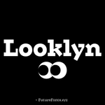
✨NEW VERSION✨ Looklyn v0.2 by @typeji adds italics to all five weights, bringing the family up to 10 styles! Next up for this affable slab serif is improved kerning and new glyphs.
futurefonts.xyz/boomtype/cru…


Typeji retweeted
2022 brought us 40 new releases and 90 updates! So grateful for the community and that we can be a part of so many amazing typefaces. Thanks so much for being a part of this! Looking forward to 2023!
Opening credits:
Tagada, Laurent Müller
Looklyn, @typeji
Gnar, @TroughtonKel
Typeji retweeted

Check out @typeji’s new font release!
Min Sans Stencil 0.1.
#femmetype #typedesign #typeface #typefacedesign #font #fonts #typedesigner


Typeji retweeted
✨NEW RELEASE✨ Min Sans Stencil v0.1 by @typeji has arrived! The stencil version of this contemporary high contrast sans brings an urban and industrial look to Min Sans. It has six weights with italics ahead.
futurefonts.xyz/typeji/min-s…


Typeji retweeted

New Font Release: Brisbane. A family of ten styles from Light to Bold with accompanying italics. Designed for use in branding, wayfinding, and text settings. buyfontshere.com. Big thanks to @thedesignguyyy: Website, Chris Skinner: Animation, @arrowtype: Font Production
Typeji retweeted

We just *had* to feature all these killer releases in this episode:
🍈 Fig Grotesk from @typeji on @futurefonts
🪦 Mausoleum from @undercasetype
⛔️ Sans Plomb from @LiftType
📰 The Feature Collection from @commercialtype
👍 Nice from @fontwerk
theinterrogangpodcast.buzzsp…

Typeji retweeted
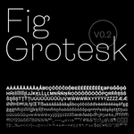
✨NEW RELEASE✨ Fig Grotesk v0.1 by @typeji is here! This friendly sans has a geometric skeleton that gives a clean, contemporary feel, while curvy terminals bring a playful personality. This release has four weights, with more ahead. futurefonts.xyz/typeji/fig-g…


Typeji retweeted

Big Update: 🌟The online "Foundations of Type Design" course is now fully accessible for everyone on the internet! Another round of thanks for the community support, this course wouldn't exist without y'all! 😍 Happy learning! #typeface #design #education typedesignschool.com

Typeji retweeted
💬 FOUNDRY FEATURE: Typeji
"Sometimes when clients ask about creating a typeface, they only think about drawing 26 letters, numerals, and punctuation, but there is much more work to do beyond this." —@typeji
futurefonts.xyz/blog/161-fou…


Typeji retweeted
✨NEW RELEASE✨ Eliptico v0.1 by @typeji is here! Diagonal stress and angled oval-shaped counters give this modern high-contrast font an elegant feel and strong personality. v0.1 has Bold and Black, with more weights ahead. futurefonts.xyz/typeji/elipt…


Typeji retweeted

+ In addition to a huge number of July's type news, we launched a new collaboration with our Japanese friends from @typecache and asked them to select the best new July releases in their opinion. It turned out to be super interesting.
type.today/en/journal/july20

Typeji retweeted
✨UPDATE✨ Min Sans v0.3 by @typeji introduces Light to the family, bringing it up to six weights. Small adjustments were made to the drawing and kerning too. Next up? Special symbols or a poster version. futurefonts.xyz/typeji/min-s…


Typeji retweeted

I am a Japanese typeface designer and I’m native to none of the scripts I work on (Latin, Greek, Cyrillic, Mongolian, Arabic, Tengwar, Tibetan, etc.). And I refuse to quit my job just because I don’t do Japanese.
Typeji retweeted

While this is generally well meaning, I find the fourth paragraph highly problematic. It promotes nativism over design skill or research & takes agency away from designers who were not born into the script.
1/


It’s time to act.
We ask the type and design industry
• to actively include more BIPOC
• to stop using the term Non-Latin
• to diversify education
• to challenge the practice of designing for scripts we did not grow up reading and writing
alphabettes.org/its-time-to-…
Typeji retweeted
With regards to the @alphabettes_org article, I take it as a matter of principle that the circumstances of your birth should not limit your career options. Not race, not gender, & not nationality. I believe in education & collaboration to build bridges, not building border walls.
Typeji retweeted
I'll be honest and vulnerable here: As a non-white person who designs Latin I have gotten many racist comments over the years, solely bc I don't look Caucasian. If you can't empathize with the @alphabettes_org article, maybe you should examine your privilege. 1/3